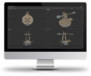
One of the most important aspects of high-quality rendering, is lighting. Lighting provides more than just the illumination for the scene, but also a sense of depth, mood, and realism through the use of shadow & color. This is even more critical when dealing with artificial characters and objects, because you want the viewer to immerse themselves into the environment, and not be distracted or pulled out of the movie by a shadow or bounce light reflection, etc., that just doesn't look right. As such, even minor adjustments to the lighting can be the difference between a good scene and a great scene.
Torch was designed to achieve improved interactivity between core workflows of multiple departments at DreamWorks Animation. It also incorporated set-based lighting with integrated particle rendering, next-generation pipeline functionality and asset management. The application reduced the production bottleneck that often occurred during the final lighting process, by increasing rendering speed, and enabling real-time reshading and faster key frame rendering. The new data model also improved memory, performance efficiency, and stability across multiple 12-core machines.
During the agile software development cycle, I collaborated with the Production Team made up of Senior Lighting Artists to create pixel-accurate visual mockups of their User Interface (UI) feature requests with the goal of integrating these new ideas into the application, and making various features more intuitive and efficient for the artist's workflows. These mockups and the accompanying functional descriptions were then shared with the Research & Development Team. During this process, I captured multiple production workflows across the studio (Crowds, Surfacing, Lighting Production, Interactive Rendering, Shadows, Multi-Shot, Visual Development, Batch Rendering, etc.) which assisted with development planning.
The software interface was fully customizable for users who required the ability to maximize their productivity in ways that personally appealed to their working style. Through usability studies with the Production Team, we determined that a darker interface was preferred, as Lighters must work in the dark in order to see colors as the movie-goer will see them. A darker interface also reduced eye strain as the user looked back and forth between the rendered scene image, and the surrounding utility.
Torch also allowed users to extend the functionality of the application by writing scripts in Python that created custom dialogs or plugins, that automated the performance of repetitive tasks. The Lightboard Tab below, was an example of such an experiment in extensibility. It was the product of a collaboration between one of the Production Lighters, Mark Decker, and myself. We both had experience in real-world theatrical lighting, and we thought it would be cool to create a utility that mimicked that experience. So we developed a Lightboard with lighting sliders that could be ganged together, and their various properties (such as color and intensity) to be keyframed.
My accomplishments during this project included:
+ Writing 476 pages of technical documentation.
+ Building 6 complete documentation frameworks (Core Reference, Application Reference, Production Testing, Transitional Instructions and Brain-Storming Discussion/Torch Scheduling page trees) to support three departments – R & D, Production Testing, and Training – in productivity and communication efforts.
+ Creating 9 Torch logo design iterations reviewed at the executive level, which ultimately resulted in the final Torch symbol rendered in collaboration with VFX pro, Billy Brooks.
+ Creating and coding online User Guide designs and developing 3 company-wide implementation methods for the same.
+ Creating and manipulating a total of 2,198 User Interface (UI) mockup images over the life of the project.
DreamWorks Animation’s “How To Train Your Dragon 2” was the first full-length feature to use the Torch Lighting System that my team worked to develop, and I am tremendously proud to say that it won the Golden Globe for Best Animated Feature. The results, as you can see below, are absolutely GORGEOUS.
Here are a few links to articles in the trades, where the software got a nice mention: