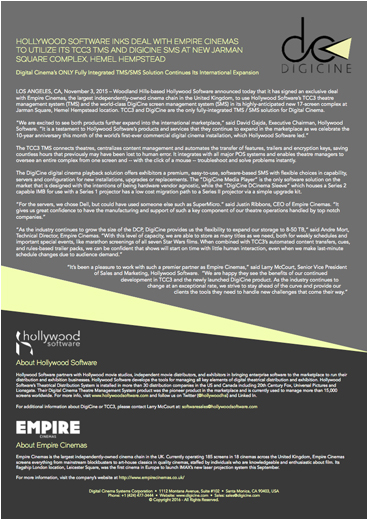
The purpose of this design was to create a template for press releases to support the client's new corporate branding, which I also developed as the Creative Director for their brand transition.
The yellow polygon was intended to echo the client's logo, while providing a visually interesting way to divide the layout between the content of the press release, and the corporate information which appears in the section below it.
Generally speaking, I am extremely tired of what I'd term the "unmotivated square blocks" that seem to dominate design at present. This design choice is less a conscious choice, but rather often in direct result of online frameworks that were intended to help non-designers such as programmers to create content online, but which have had the negative effect of leading to a certain homogeny that I find deeply boring. Any chance I get to break that trend, I take it.
+ Adobe InDesign
+ Adobe Photoshop
